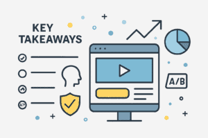
Key Takeaways:
- Uncover the key components that drive conversions on a landing page.
- Understand how to use design to guide user behavior.
- Learn the significance of A/B testing in landing page optimization.
- Get tips on how to create compelling call-to-action (CTA) buttons.
Introduction:
In the rapidly evolving digital marketing landscape, the rivalry in attracting the interest of prospective clients is intense. An effectively crafted landing page is essential for differentiation and attaining your objectives. A landing page can significantly influence the transition from a mere visitor to a dedicated customer. When you discover proven best landing page designs that convert visitors into customers, you use a powerful mechanism to bridge the gap between interest and conversion. These digital gateways are strategically designed to engage users, steering them toward making informed decisions that drive business success.
Beyond aesthetics, effective landing pages are rooted in psychology and user behavior. Elements like clear calls to action, persuasive copy, trust signals, and intuitive layouts all work together to guide visitors smoothly through decision-making. The most effective landing pages have an appealing design, anticipate the user’s needs, and eliminate obstacles in their experience. As the digital environment progresses, so too do the expectations of your audience. Continuously testing, optimizing, and adapting your landing pages ensures they stay relevant and impactful. By keeping user experience at the forefront and leveraging data-driven insights, businesses can turn their landing pages into high-performing assets that consistently convert interest into meaningful results.
Understanding the Purpose of a Landing Page
Fundamentally, a landing page is intended to accomplish a single objective—and to execute it effectively. Whether that goal is to collect email addresses, encourage a purchase, or prompt a download, the purpose must be crystal clear. A well-defined objective acts as a guiding star, ensuring every component on the page is strategically placed to support that result. Without this clarity, visitors can get mixed signals and leave without taking any meaningful action.
Crafting a message that speaks directly to the audience’s needs becomes easier when a landing page is laser-focused. Every headline, image, and button serves a purpose. The closer these elements align with the page’s objectives, the greater the probability of transforming a casual visitor into a lead or customer. In contrast, disjointed messaging or an excess of competing goals can swiftly disrupt the user experience, resulting in missed opportunities and diminished conversion rates.
Anatomy of a High-Converting Landing Page
- Headlines that Capture Attention: A strong headline is your first—and sometimes only—chance to grab someone’s attention. It sets the tone and lets visitors know they’re in the right place. The best headlines are brief yet impactful, addressing a pain point or offering a solution. When done right, they create a sense of curiosity and encourage the user to keep scrolling. Think of the headline as your elevator pitch—it needs to say a lot with very few words. Whether offering a free trial or a downloadable guide, your headline should communicate value immediately. The more relevant and emotionally resonant it is, the more likely it will lead users deeper into your content.
- Compelling Visuals: Visuals do more than make a page look pretty—they tell a story. High-quality images, engaging videos, or simple illustrations can help clarify your offer, evoke emotion, and reinforce your message. When visuals align with your headline and copy, they create a cohesive experience that feels more trustworthy and polished. Studies show that users process visuals faster than text so that the right image can make an instant impact. For example, showing a product in use or including a short explainer video can increase understanding and interest. Keeping visuals relevant and professional is key, ensuring they support the page’s overall goal.
- Clear and Concise Copy: The content on your landing page should fulfill a role that extends beyond simply filling space; it must create a meaningful connection. Compelling copy clearly outlines what’s being offered, why it matters, and what the user should do next. It should be benefit-driven, answering the visitor’s unspoken question: “What’s in it for me?” According to Search Engine Journal, a crucial aspect of a successful landing page is clarity, which eliminates distractions by using direct messaging that addresses user needs. Avoid jargon or fluff, and aim for a tone that matches your brand while still being easy to digest. Break information into short paragraphs, use bullet points where appropriate and always focus on clarity. Users who can quickly understand your value are much more likely to take action.
The Role of Design in User Navigation
Good design isn’t just about aesthetics—it’s about functionality. A well-structured landing page guides the user’s eye from one section to the next. Strategic use of white space, color contrast, and typography can subtly direct attention to key areas, such as the headline or call-to-action button.
Users can easily locate their requirements without excessive effort, significantly enhancing their overall experience. Intuitive navigation fosters confidence and maintains user engagement. Conversely, a disorganized or perplexing layout can lead to visitor frustration and deter them, regardless of the quality of your offering.
Compelling Call-to-Action (CTA) Strategies
- Crafting the Perfect CTA Button: The call-to-action button is where the magic happens—the tipping point between interest and action. Your CTA must be clear, concise, and action-oriented to be effective. Phrases like “Get Started,” “Download Now,” or “Claim Your Spot” let users know exactly what to expect. Design matters here, too. The button should stand out on the page without clashing with your brand. Use contrasting colors and ensure it’s large enough to tap easily, especially on mobile devices. A CTA that’s both visually striking and clear in its message is far more likely to get clicked.
- Placement and Timing: Where and when you place your CTA can make a big difference. Some users might be ready to convert immediately, while others need more information first. That’s why it’s smart to include your CTA in a few different spots—near the top, after key benefits, and at the bottom of the page. Timing is more than just scrolling; it’s also about matching the CTA to the user’s mindset. If someone’s just learned about your product, they might need a soft nudge like “Learn More.” But if they’re already interested, a bolder prompt like “Buy Now” could be just right. Understanding user intent helps you place the proper CTA at the right time.
Social Proof and Trust Signals
Trust is everything when it comes to conversion. Social proof—like testimonials, reviews, or endorsements—helps potential customers feel more confident in their decisions. When visitors see others have had positive experiences, it lowers their perceived risk and boosts credibility.
Incorporating social proof doesn’t have to be complicated. A few well-placed quotes, star ratings, or recognizable client logos can go a long way. These trust signals act as validation, making visitors more likely to believe in the value of your offer and ultimately take the next step.
Importance of Mobile Optimization
As the number of individuals accessing the internet via mobile devices continues to rise, optimizing for mobile is no longer a choice but a necessity. A landing page designed for mobile use guarantees that content loads swiftly is displayed appropriately and is user-friendly on smaller screens. Without proper optimization, there is a significant risk that users will leave the page before engaging with your content, including your headline. Responsive design is key here. That means using flexible layouts, scalable images, and touch-friendly buttons. A seamless mobile experience shows users that you value their time, making it far more likely they’ll stick around and convert.
A/B Testing for Continuous Improvement
Even the best landing pages can still be improved. A/B testing lets you experiment with different versions of your content to see what resonates most with your audience. Small changes, such as tweaking a headline, replacing an image, or repositioning the CTA button, can yield significant results.
The beauty of A/B testing is that it takes the guesswork out of optimization. Collecting real user data enables you to make informed decisions that improve performance over time. This iterative process keeps your landing page fresh, relevant, and aligned with evolving user behavior.
Conclusion
A successful landing page isn’t built on guesswork—it results from intentional design, focused messaging, and ongoing refinement. Every element, from the headline to the CTA, guides the user toward a specific goal. When done right, a landing page attracts visitors and turns them into loyal customers.
By understanding your audience, testing your approach, and optimizing for all devices, you can create landing pages that truly convert. It’s a blend of art and science, but the results speak for themselves when everything comes together.


